LECTURES
Week 4: Designing Type
So why design another typeface? Xavier Dupre (2007) in the introduction of his typeface Malaga suggested two reasons for designing a typeface:
- Type Design carries a social responsibility so one must continue to improve its legibility.
- Type Design is a form of artistic expression.
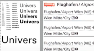
fig 1.0 Left: UNIVERS by Adobe Illustrator, InDesign (2015). Right: Airport Signage using Frutiger Week 4 (14/05/2024)
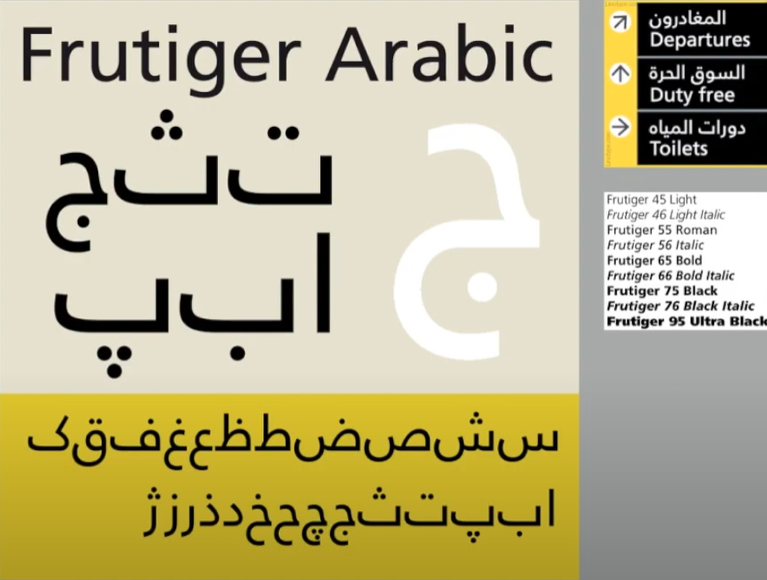
Adrian Frutiger, a prominent Swiss graphic designer of the twentieth century, excelled in typeface design. He is credited with significantly advancing typography, creating notable typefaces such as Univers and Frutiger. The Frutiger typeface, a sans serif font, was designed by Adrian Frutiger in 1968 for the newly constructed Charles de Gaulle International Airport in France.
Purpose: The aim of this typeface was to develop a clear, distinctive, and easily readable font that would be visible both up close and from a distance, prioritizing functionality.
Considerations/Limitations: The letterforms had to be legible even in low light or when viewed by people moving quickly past the signs. Frutiger tested the typeface with blurred letters to ensure they remained identifiable.
fig 1.1 UNIVERS by Adobe Illustrator, InDesign (2015). Week 4 (14/05/2024)
Adrian Frutiger received numerous accolades, but he considered his experience at a university in Varanasi, the "holy city of India," to be the highest honour, even though it came without medals or certificates. At the request of the Indian Design Institute, he created a new Devanagari font suited for modern typesetting and printing. His objective was to simplify the sacred characters while preserving their ancient calligraphic essence. As Frutiger waited on the cool floor of a high-vaulted university room, surrounded by religious dignitaries in ceremonial attire, a group of "wise men" spent considerable time evaluating his initial draft. Eventually, they delivered their verdict: they "approved" his new Devanagari design and felt it did not "desecrate something that was, for them, sacred.
fig 1.2 Adrian Frutiger at the National Institute of Design (NID), India 1964 Week 4 (14/05/2024)
Matthew Carter, son of Harry Carter, a Royal Designer for Industry and esteemed British type designer, is a contemporary type designer and master craftsman. Carter trained as a punchcutter under Paul Radisch at Enschede, managed Crosfield's typographic program in the early 1960s, and served as Mergenthaler Linotype's house designer from 1965 to 1981. Many of Carter's fonts were developed to address specific technical challenges, such as those presented by early computers. An example is Verdana (1996), created for Microsoft.
Purpose: Verdana was designed to be highly legible even at very small sizes on screens, catering to the increasing use of the internet and electronic devices.
Consideration/Limitation: Verdana's design is influenced by the pixel rather than traditional tools like the pen, brush, or chisel. It addresses commonly confused characters, such as the lowercase i, j, and l.
fig 1.3 Gorgia(TopRight) and Verdana(BottomLeft) Week 4 (14/05/2024)
In 1976, AT&T commissioned a new typeface specifically for their telephone directories to address various technical and visual issues with the existing Bell Gothic typeface. The resulting design, named Bell Centennial in honour of the company's 100th anniversary, provided the needed solution.
fig 5.7 Bell Centennial Week 4 (14/05/2024)
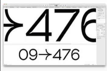
fig 1.4 Comparison between Font and Printed Week 4 (14/05/2024)
Edward Johnston created the highly influential London "Underground" typeface, later known as "Johnston Sans," in 1916. He was tasked with designing a typeface that embodied "bold simplicity," combining modernity with traditional elements Johnston's design achieved this by blending classical Roman proportions with a humanist warmth.
Purpose: The London Underground Railway commissioned calligrapher Edward Johnston to develop a new typeface for its posters and signage. He provided detailed examples of letter shapes that would influence printed text up to the present day.
Consideration/Limitation: Johnston's goal was to unify the various companies within the London Underground Group, which used the same rails and tunnels but had disparate advertising and signage. The existing signage was a chaotic mix of different letter styles. Johnston used the proportions of Roman capital letters to root his typeface in history and traditional calligraphy while ensuring it had the elegance and simplicity suited for the modern era.
fig 1.5 Typeface By Edward Johnston Week 4 (14/05/2024)
General Process of Type Design:When designing type, it's essential to understand type history, anatomy, and conventions, as well as terminologies like side-bearing, metrics, and hinting. It's crucial to define the typeface's purpose and the specific applications it will be used for, such as school buses or airport signage. Additionally, examining existing fonts currently in use can provide inspiration, ideas, references, context, and insights into usage patterns.
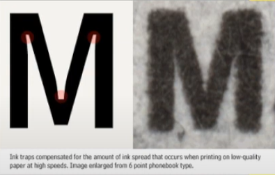
fig 1.6 In traps Week 4 (14/05/2024)
These were generally used when printing on cheap absorbent paper and when printing is fast and not very precise. Corners generally tend to suffer and as such with ink traps the corners remain visible.
Certain designers prefer to sketch their typefaces using traditional tools like brushes, pens, ink, and paper before scanning them for digitalization. They feel more confident and have better control using these tools.
Others opt to sketch their typefaces digitally using tools like Wacom tablets directly within font design software. While this method is quicker, more persistent, and consistent, it can occasionally hinder the natural flow of hand strokes. Each approach has its advantages and drawbacks.
fig 1.7 Sketch of Johnston Sans, designed by Edward Johnson Week 4 (14/05/2024)
Several professional software programs are employed in the digitization process of typefaces, with leading options including Fontlab and Glyphs App. Some designers utilize Adobe Illustrator to create or refine letterforms before importing them into specialized font applications. However, this approach is criticized by purists. During this stage, it's crucial to not only focus on the overall form of the typeface but also on the counter form. The readability of the typeface greatly relies on both aspects.
fig 1.8 Glyphs and FontLab Week 4 (14/05/2024)
Testing plays a crucial role in the design thinking process. The outcomes of testing contribute to refining and correcting various aspects of the typeface. Prototyping is integral to testing and provides valuable feedback.
The readability and legibility of a typeface are significant considerations, particularly based on its category (display or text type). However, if the typeface falls into the display category, where expressing form is prioritized to some extent, readability and legibility may not be as critical.
fig 1.9 Prototype Stencil (Stenz) developed and designed by Vinod J.Nair Week 4 (14/05/2024)
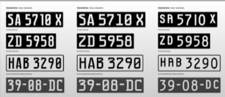
Even after a typeface is deployed, unforeseen issues may arise that were not evident during the prototyping and testing phases. Therefore, the need for revision persists even after deployment. Rigorous testing is crucial to ensure that any emerging issues remain minor in nature.
fig 1.10 Prototype Number Plate Typeface Myno & Nomy developed and designed by Vinod J.Nair Week 4 (14/05/2024)
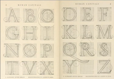
Roman Capital: The grid comprises a square enclosing a circle that touches the corners of the square at four points. Inside the square, there is a rectangle positioned centrally, measuring three-quarters the size of the square. Therefore, employing grids with circular forms can simplify the construction of letterforms and is a viable method for their creation and design.
fig 2.0 Construction Grid For The Roman Capital Week 4 (14/05/2024)
Construction and Considerations:
The 26 characters of the alphabet can be organized into groups based on their form and structure. These groups typically distinguish between uppercase and lowercase letters.
fig 2.1 Classification According To Form and Construction Week 4 (14/05/2024)
When designing a new typeface, various forms and constructions need consideration. One crucial visual adjustment involves ensuring that curved forms extend appropriately beyond both the baseline and cap line. This principle also extends to aligning curved and straight forms vertically.
Another visual correction concerns the spacing between letters. It's insufficient to merely place letters adjacent with equal spacing between them. Instead, adjustments must be made to achieve a uniform "visual" white space between letters, a process known as "fitting" the type.
Week 5: Perception and Organisation
Perception is defined as "how something is regarded, understood, or interpreted." This raises the question: Is perception based on what you directly see and comprehend, or is it influenced by external factors shaping your understanding? In typography, perception involves how a reader visually navigates and interprets content through elements like contrast, form, and organization. This content can be textual, visual, graphical, or involve colour. But how does contrast function in this context, and what does form encompass?
fig 2.2 Example Of Contrast by Rudi Ruegg Week 5 (24/05/2024)
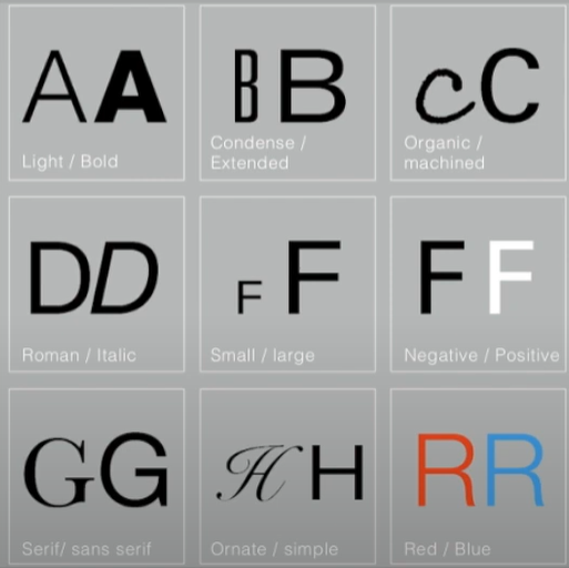
Contrast
There are various techniques in typography to create contrast, with the method on the left being developed by Rudi Ruegg. These methods are straightforward and easy to understand.
Carl Dair, on the other hand, introduces two additional principles—texture and direction—to enhance design clarity and impact using contrast in typography. Dair outlines seven types of contrast (many of which overlap with Rudi Ruegg's concepts, albeit with different terminology)
1. Size
2. Weight
3. Form
4. Structure
5. Texture
6. Color
7. Direction
These principles aim to make the design stand out clearly and stylishly.
fig 2.3 Example Of Contrast by Carl Dair Week 5 (24/05/2024)
Contrast In Size
Contrast in size captures the reader's attention by creating a focal point. For instance, when there is a large letter next to a small one, the large letter naturally draws the eye first. This technique is commonly used to make titles or headings significantly larger than the body text, ensuring they stand out.
fig 2.4 Example Of Contrast In Size Week 5 (24/05/2024)
Contrast In WeightWeight refers to how bold type can stand out amidst lighter type of the same style. Besides using bold text, incorporating elements like lines, spots, or squares can also create a "heavy area" that serves as a strong visual focal point or emphasis, providing contrast not just through varying text weights.


fig 2.5 Example Of Contrast In Weight Week 5 (24/05/2024)
Contrast In Form
The contrast of form refers to the differences between a capital letter and its lowercase counterpart, or between a Roman letter and its italic version. This also includes the variations between condensed and expanded typefaces.
fig 2.6 Example Of Contrast In Form Week 5 (24/05/2024)
Contrast In Structure
Structure refers to the different letterforms or types of typefaces. For instance, it includes contrasts between a monoline sans serif and a traditional serif, or between an italic and a blackletter typeface.

 fig 2.7 Example Of Contrast In Structure Week 5 (24/05/2024)
Contrast In Texture
By combining contrasts of size, weight, form, and structure and applying them to blocks of text on a page, you create contrast in texture. Texture pertains to the overall appearance of lines of type both up close and from a distance. This effect depends on the letterforms themselves and their arrangement.


fig 2.8 Example Of Contrast In Texture Week 5 (24/05/2024)
The contrast of direction involves the opposition between vertical and horizontal orientations, as well as the angles in between. Rotating a word to its side can significantly impact a layout. Text blocks also exhibit vertical or horizontal directional aspects. Combining wide blocks of long lines with tall columns of short lines can also create a directional contrast.


fig 2.9 Example Of Contrast In Direction Week 5 (24/05/2024)
Contrast In Colour
The use of colour suggests that a second colour often has a less emphatic impact than plain black on white. Therefore, it's important to consider which elements need emphasis and to pay attention to the tonal values of the colours used.

fig 2.10 Example Of Contrast In Colour Week 5 (24/05/2024)
fig 3.0 The Correct Use Of Contrast Week 5 (24/05/2024)
Form
Form refers to the overall appearance and feel of the elements within a typographic composition. It significantly contributes to the visual impact and initial impressions. Good form in typography is visually engaging, guiding the eye from point to point, captivating the mind, and often being memorable.
fig 3.1 Example Of Form Week 5 (24/05/2024)
Originating from the Greek words "typo" (form) and "graphics" (writing), typography means writing in accordance with form. Typography serves two functions:
1. To represent a concept
2. To convey it visually
Displaying type as a form highlights the unique characteristics and abstract presentation of letterforms.
fig 3.2 Examples Week 5 (24/05/2024)
The interplay between meaning and form creates a balanced harmony in both function and expression. When a typeface is seen as a form, it ceases to be read as a letter because it has been altered through distortion, texture, enlargement, and extrusion into space.
fig 3.3 Example Of Forms and Communication In Together Week 5 (24/05/2024)
Organisation / Gestalt
Gestalt is a German word that means the way something has been "placed" or "put together." Gestalt Psychology seeks to understand the laws behind our ability to acquire and maintain meaningful perceptions. Gestalt psychologists, particularly Max Wertheimer, developed several "laws" that predict how perceptual grouping happens under various conditions. Technically, in science, laws are predictions that are always true. However, in practice, these laws are more accurately described as principles.
Gestalt theory emphasizes that the whole is greater than the sum of its parts, based on the idea that we perceive things as unified wholes. Instead of analyzing thoughts and behaviours into their smallest elements, Gestalt psychologists believed in considering the entire experience. In design, this means that the components or elements of a design are only as effective as the overall visual form. While each component may function well individually, the overall form is more significant than the sum of its parts.
Organisation / Gestalt: Perceptual Organisation / Groupings
1. Law Of Similarity
2. Law Of Proximity
3. Law Of Closure
4. Law Of Continuation
5. Law Of Symmetry
6. Law Of Simplicity (Praganz)
fig 3.4 Gestalt Principles Week 5 (24/05/2024)
The Law of Similarity, a Gestalt grouping principle, states that elements that are similar to each other are perceived as a unified group. Similarity can involve various features such as colour, orientation, size, or motion.
The Law of Proximity, another Gestalt grouping principle, states that elements that are close to each other are perceived as a unified group. This principle suggests that items near each other tend to be grouped together, while items that are farther apart are less likely to be seen as a group.
fig 3.5 Similarity and Proximity Week 5 (24/05/2024)
The Law of Closure describes the mind's inclination to perceive complete figures or forms even when a picture is incomplete, partially obscured by other objects, or missing some information needed to form a complete image.
The Law of (Good) Continuation states that humans tend to perceive two or more intersecting objects as distinct, continuous, and uninterrupted entities. The alignment of these objects or forms is crucial for this principle to take effect.
fig 3.6 Continuation and Closure Week 5 (24/05/2024)
The Law of Symmetry (Law of Praganz)
We can learn more about these laws by checking the provided links or searching online. However, be aware that interpretations may vary, and you'll need to evaluate them to form your own understanding.
The goal is to ensure awareness and inform your work process. Organizing complex content hierarchically requires practice and the knowledge gained here, as well as from other sources. Knowledge from reading, listening, and viewing must be applied and practised to be retained and effective.
fig 3.7 Symmetry Week 5 (24/05/2024)
INSTRUCTIONS
Task 2 (A): Main Artwork
A key artwork is a wordmark or a lettering but also an artwork. As a wordmark/lettering it is used to identify a person but it is also used as an artwork that might adorn a label pin/T-shirt/Poster (Collaterals). In this task, we need to explore and compose as many permutations and combinations of our name in the form of a wordmark or lettering and develop a key final artwork.
Sketching & Idea Development :
Before starting any ideas, I created a mind map of myself to do some soul searching to understand myself better.
 |
| FIG.1.1MIND-MAP |
Sketches
 |
| fig 1.2 Keywork Attempt |
Because my name translates to "sailboat" in Chinese, it embodies a sense of flying freely. This feeling imparts a unique style to my work, with my creations generally exhibiting a forward-leaning posture, much like the experience of sailing into the wind. This is not just a visual representation, but also a conveyance of emotion and atmosphere, reflecting the spirit of pursuing freedom and forging ahead. Through my work, I hope to bring the audience a sense of lightness, fluidity, and boundless freedom, akin to a sailboat navigating the open sea, always moving forward.
 |
| fig 1.3 Keywork Attempt |
WEEK5
This logo cleverly uses cutting and symmetrical design to uniquely showcase the four letters "WAWG." Each letter's shape and cutting angles are meticulously crafted, making the overall design look modern and full of geometric artistic sense.
After my thought, I found that Wang did not provide much room for innovation and change, so I decided to use my name for the Yifan version.
 |
fig 1.3 preliminary draft
fig 1.4 preliminary draft
|
 |
| fig 1.5 preliminary draft |
Typography: Geometric shapes and lines showcase modernity and creativity.Dynamic Feel: The arc at the top creates a sense of motion, symbolizing progress and forward movement.Unique Shape: The combination of the letters "Y" and "F" is smooth, simple, and impactful, making it easy to remember.Technological Feel: The geometric shapes and lines convey a sense of high-tech and modernity.Personalization: The unique design reflects the individual or brand's style and personality.
WEEK6
Then, in the sixth week, Mr. Vinod confirmed my design idea but he thought my shape was too common and needed to be changed. Mr. Vinod then gave me some advice.
This form
Task 2 (B): Collateral
Before I start creating collateral, I watch examples for reference. I find it easy to become visually fatigued if I only use a single key art work. So I explore and extend my artwork.
 |
Art Work 1,Week 8
|
 |
Art Work 2,Week 8
|
 |
Art Work 3,Week 8
|
These colors blend together in a gradient, creating a smooth transition effect. This gradient brings a sense of harmony and continuity, making the transition between each color natural and fluid.
Overall, this color scheme and design convey a lively, harmonious, and hopeful feeling. Each color has its specific symbolism, and their combination through a gradient creates a unique visual appeal while evoking positive emotions in the viewer.
In conclusion, this color scheme skillfully utilizes the diversity and symbolism of rainbow colors. Through the gradient effect and the design of the letter "W," it creates a vibrant and hopeful visual experience.
 |
FIG.2.2 SELFIES |
I then started creating collateral on the Mockups website.In the end, I chose five products and typeset them into two groups.
 |
Collateral 1,Week 8
|
 |
Collateral 2,Week 8
|
 |
Collateral3,Week 8
|
 |
Collateral 4,Week 8
|
 |
Collateral 1,Week 8
|
I then did the layout of the Instagram page in adobe illustration.FINAL PROJECT-2B
 |
Fig. 2.5 collateral and identity extensions |
Final outcome for Collateral
WEEK7
KA Animation
When attempting the animation, I first chose to create the clip I needed in illustration.
I then imported these clips into AE and added effects to them.
For these clips I set them to different transparency settings to make them appear in the right place, and I adjusted the speed and position of the different layers. It makes the animation more natural and smooth.
FINAL ANNIMATION:
 |
FIG.2.18 FINAL OUTCOME
|
 |
FIG.2.17 WORK IN AE
|
Feedback
Week 5
Specific Feedback: I should have added some innovation to the name I used. I should have chosen a name with more than four letters.
General Feedback: The logo design should be as simple and elegant as possible, not too fancy.
Week 6
Specific Feedback: The font design needs to maintain the uniformity of the font, such as keeping a relatively stable distance between the strokes of the letters.
General Feedback: Make sure your message is easy to understand and direct. Design a distinctive logo that shows who we are, rather than making a logo that follows the current style.
Week 7
Specific Feedback: I need to make an image with the darkest background, lightest letters, and darkest letters based on my color palette, with two clear extensions.
General Feedback: Vinod sir explained why it is important to have a logo that can change to fit different screens and sizes so that it still looks good and is easily recognizable in various situations. Vinod sir also suggested that we do a case study from the Pentagram website he gave us to get more ideas on how to extend our logo.
Week 8
No feedback for the independent learning week.
Reflection
Experience
Throughout my learning journey, I've acquired the skills to design a simple yet personalized logo. When working on font design, it's crucial to innovate and create unique designs that stand out while enhancing their value.
Transitioning font designs from manuscript to digital formats requires careful adjustments to maintain overall integrity and highlight distinctive features, ensuring unity and coherence in the details.
This stage of practice has significantly improved my efficiency and proficiency with design software, allowing me to discover various techniques and elevate my design quality. It has also emphasized the importance of innovative design concepts and meticulous detail control.
I will continue to apply these experiences to further improve myself.
Observation
I examined the design characteristics of different fonts, including their shapes and spacing. By analyzing their effects in various application scenarios, I aimed to find the most suitable design.
I studied the different styles and features of various fonts. For example, to design fonts that evoke comfort and warmth, I opted for more rounded shapes.
Additionally, I observed how words can be integrated with images and discussed the application of text design in everyday life.


评论
发表评论