Advanced Typography/Task3
June 15, 2024 - (Week 8 - Week 14 )
Wang Yifan/ 0368363
Advanced Typography / Bachelor of Creative Media Design (Honours)
Task 3: Type Exploration and Application
TABLE OF CONTENTS
- Lecture
- Instructions
- Task 3
- Feedback
- Reflection
- Further reading
LECTURE
Lecture 5: AdTypo_5_Perception & Organisation
Perception in Typography
Perception involves how something is perceived, understood or interpreted. In typography, it is about how readers visually navigate and interpret content through contrast, form and organisation.
Contrast
Carl Dair’s seven types of typographic contrast:
Attract attention through noticeable size differences, such as making the title larger than the body text.
Example: Amnesty International’s campaign poster uses large text to attract the reader’s initial attention, rather than using small text.

Contrast of size - Awareness posters by Amnesty International;
The big text will first draw the reader's attention before the small text.
The big text will first draw the reader's attention before the small text.
Weight contrast: Bold text stands out among lighter fonts of the same style. Heavier areas created by rules, spots and blocks add visual emphasis.
Example: Bold text in Venngage’s graphic stands out among lighter text.

Contrast of weight
Form contrast: Differences between uppercase and lowercase, roman and italic variants, condensed and expanded versions of a typeface.
Example: Fashion Gone Rogue uses a variety of typefaces to create contrast.

Contrast of form
Structural contrast: Different typefaces in a variety of fonts, such as a monoline sans serif versus a traditional serif, or an italic versus a boldface.
Example: Fabian Fohrer’s poster juxtaposes different types of structure.

Contrast of structure - Poster by Fabian Fohrer
Textural contrast: Combining size, weight, form, and structural contrasts in blocks of text to create texture that affects readability and aesthetics.
Example: Yve Ludwig’s Yale School of Architecture poster uses texture to draw visual interest.
Directional contrast: Differences in direction, such as vertical versus horizontal lines or angles.

Contrast of texture -Yale School of Architecture Poster by Yve Ludwig;
Example: Benjamin Kowalski’s poster uses directional contrast to direct the eye.

123
Color contrast: Using color for emphasis, where the secondary color is not emphasized as much as the black text on a white background.

Typographical Contrast by Rudi Ruegg
Form
Form refers to the overall visual impact and first impression of a printed element. It emphasizes the unique characteristics of a typeface and its abstract presentation when manipulated through distortion, texture, and enlargement.
Organization
Derived from the German words for “to place” or “to put together,” Gestalt theory emphasizes that the whole is greater than the sum of its parts. Max Wertheimer’s Gestalt principles include:
- Law of Similarity: Similar elements are perceived as a unified group.
- Law of Proximity: Elements that are close to each other are perceived as a group.
- Law of Closure: The mind completes incomplete figures.
- Law of Continuity: Intersecting objects are perceived as continuous.
- Law of Simplicity (Prägnanz): Simple, orderly structures are preferred.
These principles guide how elements should be organized to create a cohesive and visually appealing design.
INSTRUCTIONS
Task 3|Type exploration and application
In task 3, we were instructed to create a font based on the three options given:
- Create a font that is intended to solve a larger problem/ part of a solution in the area of your interest.
- Explore existing letterforms in an area of interest.
- Experimental design
From the options given, we were instructed to present a proposal consisting of our ideas related to the topic. Below is my proposal presentation:
 |
| Idea source Week 10 |
Digitalisation process
Mr Vinod suggested using this for crafting rounded corners in a more concise way
 |
| Circles for crafting letters ,Week 10 |
Rough Digitization
For my font production, I like round fonts, so I will use round squares to make my font. This is my production process mainly based on graphic modification.
I make my letter by collage of circles and other shapes in the form of underlining.
 |
| Preliminary generation of the letter A, Week 10 |
 |
| Preliminary generation of the letter Y, Week 10 |
 |
| Preliminary generation of the letter m, Week 10 |
 |
| Preliminary generation of the letter e, Week 10 |
In the end, I still used the form of reference lines and grids to make my font. I used the uppercase ABCD as a reference in AI so that I could better control the size of all the big messages and the thickness of the strokes.
 |
| Reference Line,Week 11 |
 |
| After Development,Week 11 |
 |
| Preliminary and complete development,Week 11 |
After the initial production of all the capitalizations, the existing thickness and size are not uniform, so I began to modify it in detail again.
I spent a lot of effort on the font modification. I adjusted the size and spacing.
 |
| Modification process,Week 11 |
Adjust the inner and outer outlines of the numbers so that they look clear and match the style of the letters. Pay attention to the alignment and spacing of the numbers.
 |
| Adjust Spacing,Week 11 |
 |
| Further modifications,Week 11 |
Finalized outcome uppercase & lowercase
 |
| Finalized uppercase & lowercase letterforms, Week 11 |
FontLab
But there are still some letters that don't look so uniform, but because I can't see them, I will import them.
 |
| Import Fontlab Week 12 |
 |
| Import Fontlab Week 12 |
After importing, I realised the severity of my font error, so I started to re-modify the AI
|
| Ai found problems and modified them,Week 12 |
After the modification is completed, I will import it into fontlap and start to modify the specific words and height of each letter to keep it uniform.
Kerning

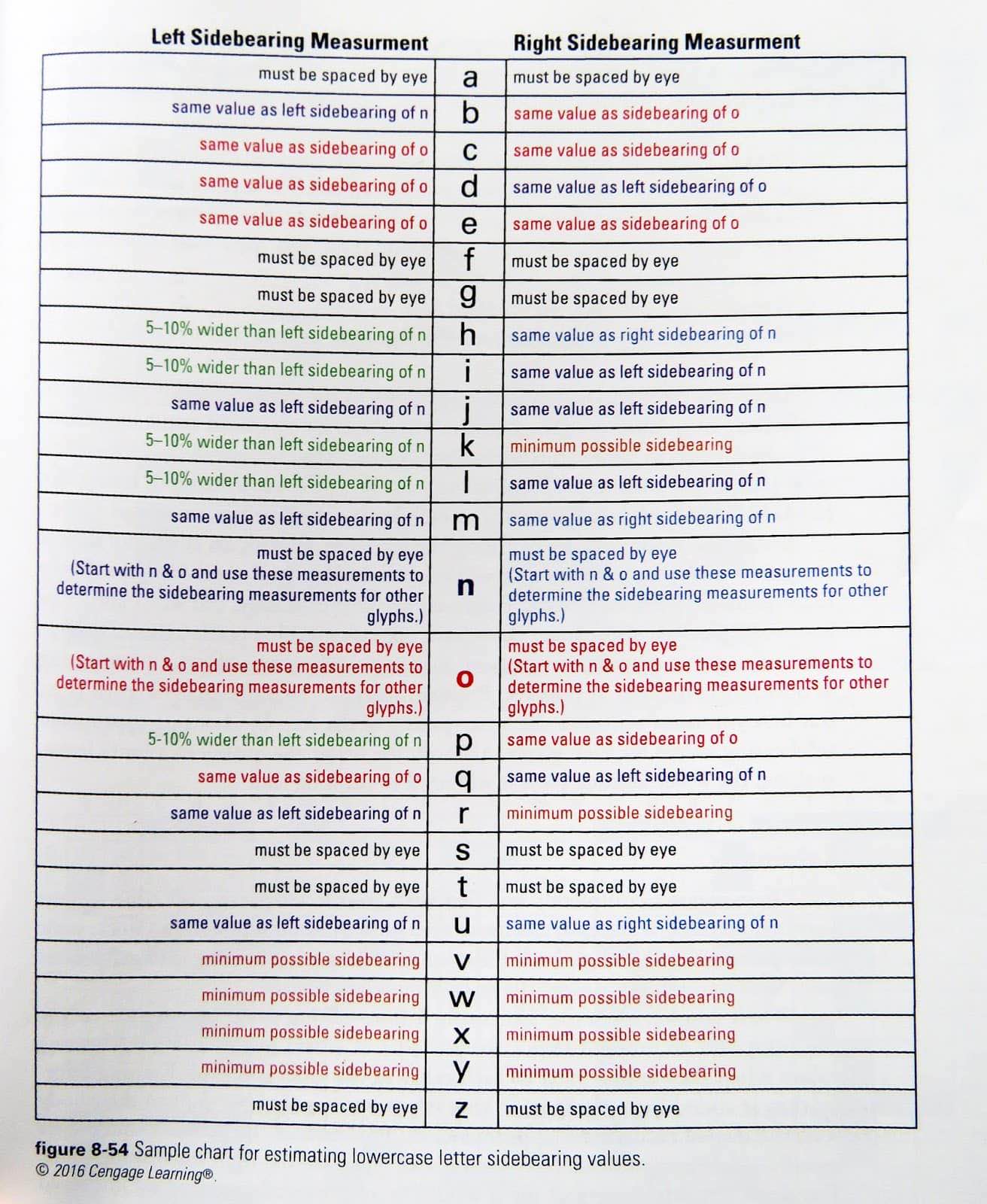
Sidebearing measurement table, Week 12
 |
| Adjust font spacing Week 12 |
 |
| Adjust font spacing Week 12 |
After the production is completed, I will generate the font.
 |
| Export fonts Week 12 |
 |
| Export fonts Week 12 |
Font Presentation
After exporting the fonts, I started to create the font presentation, after observing the demonstration given by Mr. Vinod, I started by looking for inspiration for the colour scheme on COLOUR HUNT.
I chose a small and fresh style for the main colour of the demonstration. I like this pink summer feeling. This colour scheme ensures the overall beauty of the font. Star River readability. For the font demonstration, I also chose some sentences and words to show the personality of my font.
 |
| Colour Palette, Week 13 |
I have made many modifications and attempts on the poster production process.
 |
| Production process,Week 13 |
 | |
|
Use the model to apply the finished graphics. I chose some common objects.
 |
| manufacture complete,Week 13 |
 |
| final effect,Week 13 |
FONT PRESENTATION (5 artworks)[1024 px; JPG 300 ppi]
 |
Font Presentation 1, Week 13 |
 |
Font Presentation 1, Week 13 |
 |
Font Presentation 1, Week 13 |
 |
Font Presentation 1, Week 13 |
 |
Font Presentation 1, Week 13 |
Finally PDF
Final Font Demo - PDF, Week 14
FONT APPLICATIONS (5 artworks)[1024 px; JPG 300 ppi]
 | ||||
Font Application 1, Week 13


  |

Finally PDF
Designed fonts are linked to .ttf fonts
Link to TTF font file:https://drive.google.com/file/d/1Qqid0Nuj3BMelig7iiELNB86ehfX2I8X/view?usp=sharing
FEEDBACK
Week 9:
General Feedback: From the previously provided suggestions, select one to implement and ensure the grid is visible behind the letters being created.
Week 10:
General Feedback: Maintain consistency in all letters and use the underlying grid to simplify the process. Make sure the guides are clear.
Specific Feedback: Utilize the grid for consistency; the letters appear uneven in thickness and height.
Week 11:
Specific Feedback: The capitalization of letters is inconsistent; ensure capital letters are placed before other elements. The lines have a smooth flow.
Week 12:
General Feedback: Establish a color palette for the typography and typography apps to enhance usability. For the typography apps, begin by identifying the problem you aim to solve before developing the app.
REFLECTION
This project was my first attempt at creating a complete typeface, and it was a brand new experience for me. Throughout the process, I encountered many difficulties and problems, but these challenges provided me with valuable growth opportunities. This experience allowed me to deeply understand the complex process of making a complete typeface.
Designing a complete font enabled me to observe many new aspects of typography, which were entirely different from the simple letters I created in the first semester. The complete font design required meticulous adjustment of each letter's size and position, as well as the spacing when letters are paired together. This process deepened my understanding of the nuances involved in font design.
I realized that making an excellent font requires extensive experimentation and fine-tuning, and the process is both long and exhausting. Initially, I thought font design would be a simple task, but the actual process revealed its true difficulty. This experience not only improved my design skills but also increased my respect for the art of font design. I am very grateful for this experience as it gave me a deeper understanding and appreciation of typeface design.


评论
发表评论